- Published on
A simple way to data visualization and correlation with seaborn.heatmap Python function.
- Authors
- Name
- Rostyslav Sipakov

- @RossSipakov


Introduction
Visualizing data is an art in which people are either talented or not. The good news for you is that Python has a library called Seaborn, which provides high-level tools such as heatmaps to visualize your data and make correlations with it more leisurely. This blog post will show how to use seaborn.heatmap function to do just that!
Also, check the post's footer for an easy way to run your Jupyter Notebook in the Google Colaboratory. "Google Colab" is available for free to anyone with a Google account.
Getting started
The first step is to read the data set. To do this, we'll use the Pandas library.
# Importing libraries
import seaborn as sns
import numpy as np
import pandas as pd
import matplotlib.pyplot as plt

# Additional libraries that needed to loading a .csv file from GitHub in Python
import requests
import io
Loading .csv file in Python from GitHub
The second step is downloading data from .csv file hosted in the public repository on GitHub.
# Downloading the csv file from GitHub (make sure the url is the raw version of the file on GitHub)**
url = "https://raw.githubusercontent.com/rsipakov/PythonProjectsShared/master/seaborn/SO2_HCHO_correlation/Dataset_SO2_HCHO_post_20_Kyiv_2017.csv"
download = requests.get(url).content

# Reading the downloaded content and turning it into a pandas dataframe
SO2_df = pd.read_csv(io.StringIO(download.decode('utf-8')))
If you need to download data from a private repository, you need to use a personal access token.
# Username of your GitHub account
github_username = 'YOUR GITHUB USERNAME'

# Personal Access Token (PAO) of your GitHub account
personal_token = 'YOUR GITHUB PAO'

# Creates a reusable session object that includes your GitHub credentials.
github_session = requests.Session()
github_session.auth = (github_username, personal_token)

# Downloading the csv file from your private repository on GitHub (make sure the url is the raw version of the file on GitHub)**
url = "https://raw.githubusercontent.com/rsipakov/PythonProjectsShared/master/seaborn/SO2_HCHO_correlation/Dataset_SO2_HCHO_post_20_Kyiv_2017.csv"
download = requests.get(url).content

# Reading the downloaded content and turning it into a pandas dataframe
SO2_df = pd.read_csv(io.StringIO(download.decode('utf-8')))
This is how the DataFrame looks
# View the first five rows of the data
SO2_df.head()
| # | SO2 | NO2 | NO | HCHO |
|---|---|---|---|---|
| 0 | 0.0184 | 0.0368 | 0.0258 | 0.0018 |
| 1 | 0.0214 | 0.0735 | 0.0414 | 0.0039 |
| 2 | 0.0463 | 0.1530 | 0.0898 | 0.0062 |
| 3 | 0.0517 | 0.1629 | 0.0947 | 0.0026 |
| 4 | 0.0138 | 0.0494 | 0.0380 | 0.0015 |
# Generate the correlation matrix
SO2_df.corr()
| # | SO2 | NO2 | NO | HCHO |
|---|---|---|---|---|
| SO2 | 1.000000 | 0.516845 | 0.657316 | 0.365689 |
| NO2 | 0.516845 | 1.000000 | 0.816463 | 0.686926 |
| NO | 0.657316 | 0.816463 | 1.000000 | 0.626236 |
| HCHO | 0.365689 | 0.686926 | 0.626236 | 1.000000 |
# Output data correlation into .xlsx file
cr1 = SO2_df.corr()
cr1.to_excel("output_SO2_HCHO.xlsx")
Basic seaborn.heatmap()
# Generate a heatmap using .corr() function
sns.heatmap(SO2_df.corr())


# Save heatmap in the .png format
sns.heatmap(SO2_df.corr())
plt.savefig('heatmap_SO2_HCHO.png', transparent=True)
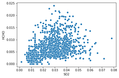
One more, basic seaborn.scatterplot()
# Generate a scatterplot
sns.scatterplot(x='SO2', y='HCHO', data=SO2_df)

# Save scatterplot in the .pdf format
sns.scatterplot(x='SO2', y='HCHO', data=SO2_df)
plt.savefig('scatterplot_SO2_HCHO.pdf')
NOTE
- If you would like to download data set from a local file (for example, .xls), use the following:
SO2_df = pd.read_excel('/PATH TO/Dataset_SO2_HCHO_post_20_Kyiv_2017.xls', engine='xlrd')`
Conclusion
In this blog post, I'm gone over the basics of how to create and use heatmaps in Python. Now, you get quickly started with your Jupyter Notebook project right here in Google Colaboratory.
You may get started immediately by importing a Jupyter Notebook for this tutorial from my public GitHub repository.
I hope you found this blog post helpful. If so, please share with your friends! Thank you for reading.
Feel free to comment on Twitter what you thought of it. Something broken? File a bug